Color Theory for Print Design
Introduction: In the realm of print design, color is more than a visual element; it's a potent tool that communicates emotions, elicits responses, and creates enduring impressions. Understanding color theory is pivotal for crafting designs that resonate with audiences and effectively convey intended messages. This exploration delves into the captivating world of color theory and its transformative potential for elevating print designs.
The Basics of Color Theory: Color theory delves into the relationships between colors and their impact on human perception. The color wheel serves as a fundamental tool that categorizes colors, assisting designers in crafting harmonious and visually appealing compositions.
- Primary Colors: Red, blue, and yellow are the foundational hues from which all other colors derive. They cannot be created by blending other colors.
-
Secondary Colors: Mixing two primary colors produces secondary colors:
- Red + Blue = Purple
- Blue + Yellow = Green
- Yellow + Red = Orange
- Tertiary Colors: Tertiary colors result from blending a primary color with a neighboring secondary color on the color wheel. These include shades like red-orange and blue-green.
Color Harmony: Color harmony involves strategically combining colors to create visually pleasing arrangements that convey specific moods or messages. Several common color harmonies include:
- Analogous: Using neighboring colors on the color wheel to establish cohesion and harmony.
- Complementary: Pairing colors located opposite each other on the color wheel for vibrant and energetic contrast.
- Monochromatic: Employing various shades and tints of a single color for a sophisticated and unified appearance.
Color Psychology in Print Design: Colors evoke emotions and associations, making them potent tools in print design:
- Red: Energetic, passionate, and attention-grabbing. Often used for calls to action and urgent messages.
- Blue: Calm, trustworthy, and professional. Frequently used by businesses to convey reliability.
- Green: Fresh, organic, and growth-oriented. Commonly utilized for eco-friendly and health-related products.
- Yellow: Bright, cheerful, and optimistic. Invokes feelings of happiness and warmth.
Color Accuracy in Print: Ensuring desired color accuracy in print demands meticulous attention to detail:
- Calibrated Monitor: Ensure accurate color display on your monitor to prevent disparities between screen and print.
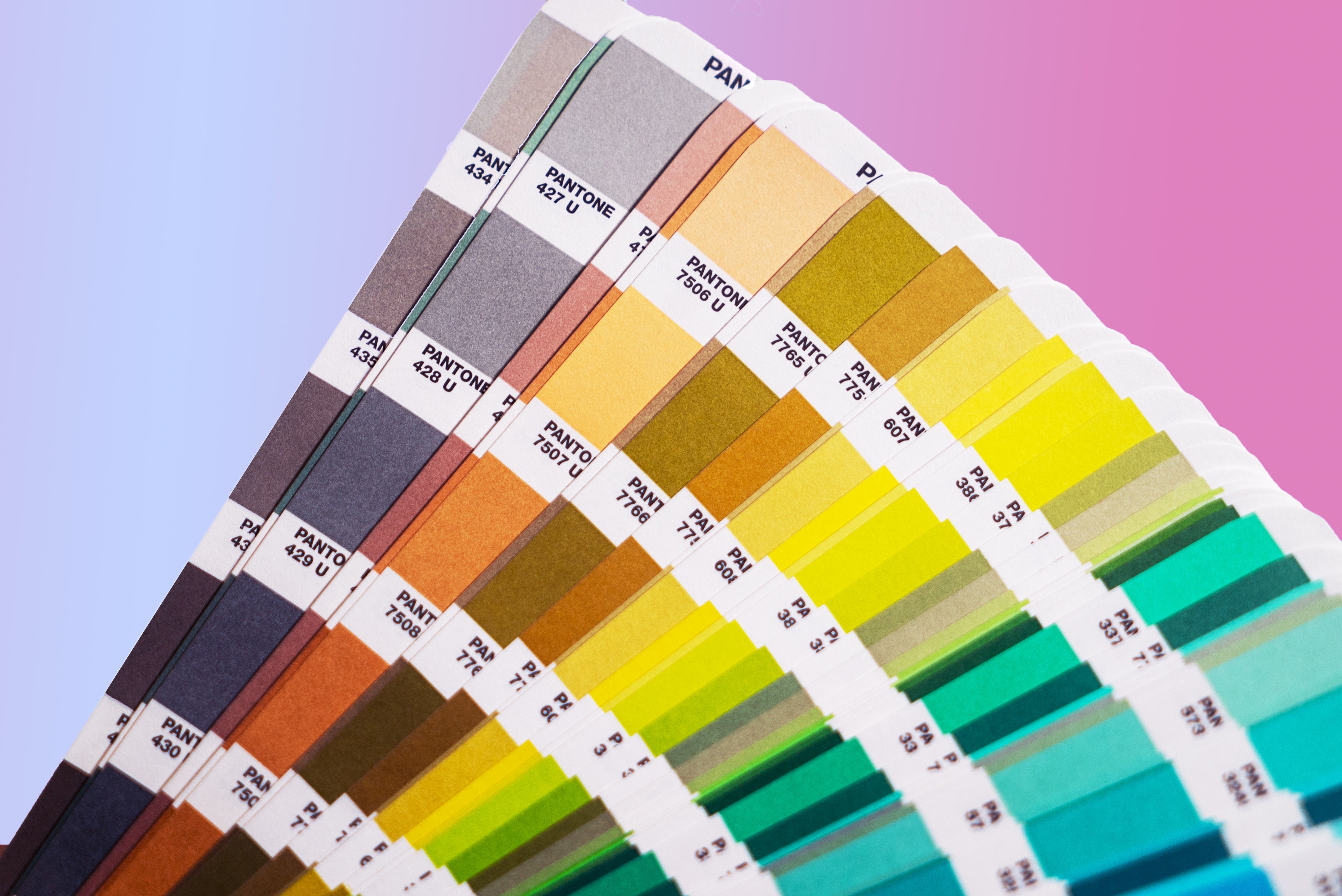
- CMYK vs. RGB: Convert designs to CMYK color mode before printing, as it aligns with the printing color model.
Infusing Color Theory into Printpire's Designs: Printpire acknowledges color theory's significance in impactful print designs. Our design experts employ their grasp of color psychology and harmony to craft materials resonating with your target audience.
Conclusion: Color theory empowers print designers with a dynamic tool to evoke emotions, communicate messages, and establish brand identity through color choices. By integrating color theory principles, your print materials will leave a lasting, memorable impression on viewers.
Contact Printpire Today: Collaborate with our design professionals well-versed in the art of color theory. Let us infuse your print designs with captivating and communicative colors, bringing them to life. Contact Printpire today to make an impact through the language of color.
